Soho Parish School | Visual Identity
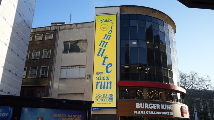
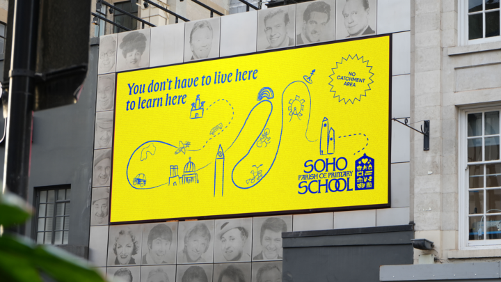
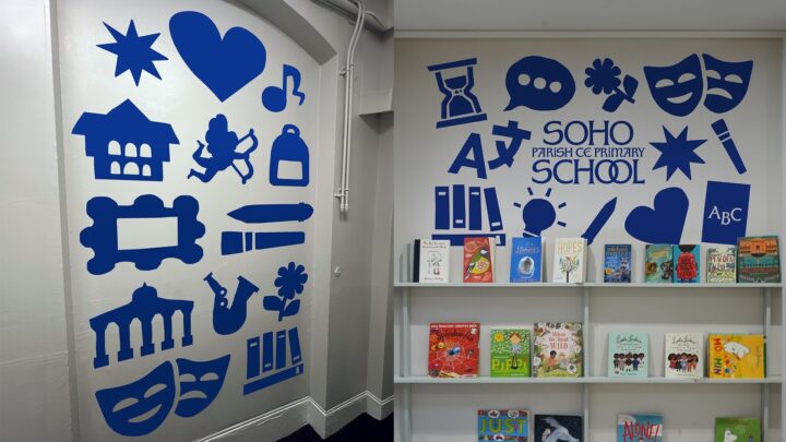
As part of the Neighbourly Fund - an annual pro bono initiative supporting local organisations through branding and design- we created a new identity for Soho Parish Primary School centred on the idea that "There's only one Soho school." Inspired by the school's iconic building, the new logo is filled with illustrated icons representing the school and its Soho community, all co-created with pupils through collaborative workshops. An interactive logo generator allowed children to create their own bespoke versions by selecting their favourite subjects and local landmarks, embedding the identity across the school community.
Results
- The rebrand helped drive a 7% increase in applications.
- A 55% increase in open day visits.
- Welcomed 16 new pupils for the 2024–25 academic year.
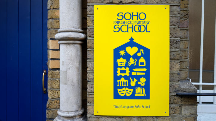
The project features the colours yellow and blue as well as a new logo, taking the silhouette of the main school building and filling it with icons that represent the school and its surroundings in London.
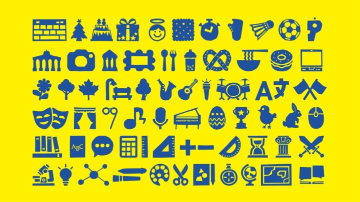
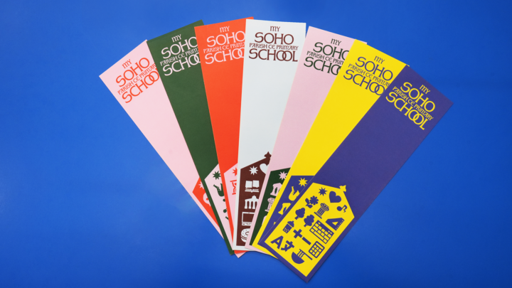
The icons were designed in collaboration with the school’s pupils in a workshop where they shared what they loved most about the school and being in Soho.
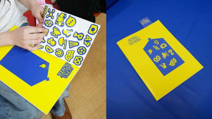
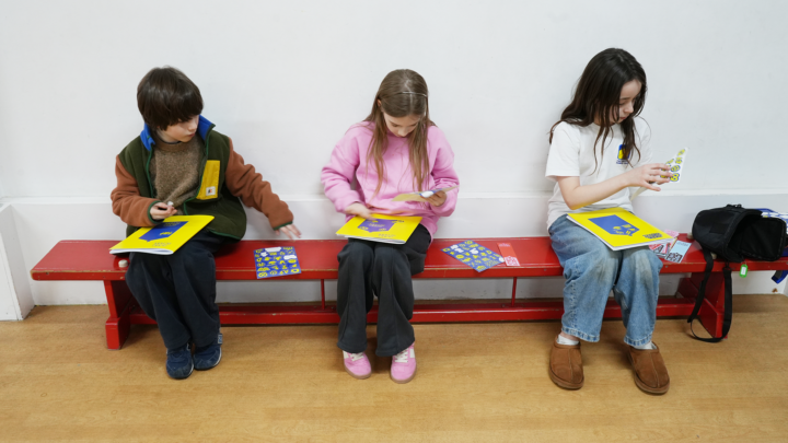
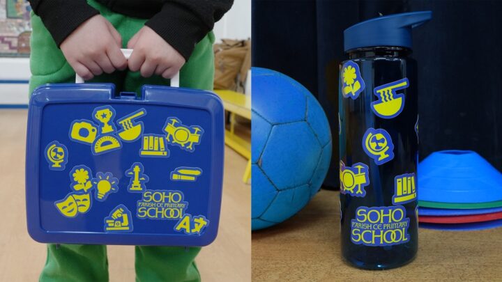
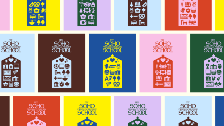
An interactive logo-generation tool was also created, which invites pupils to input their favourite subjects and Soho institutions to create a bespoke version.