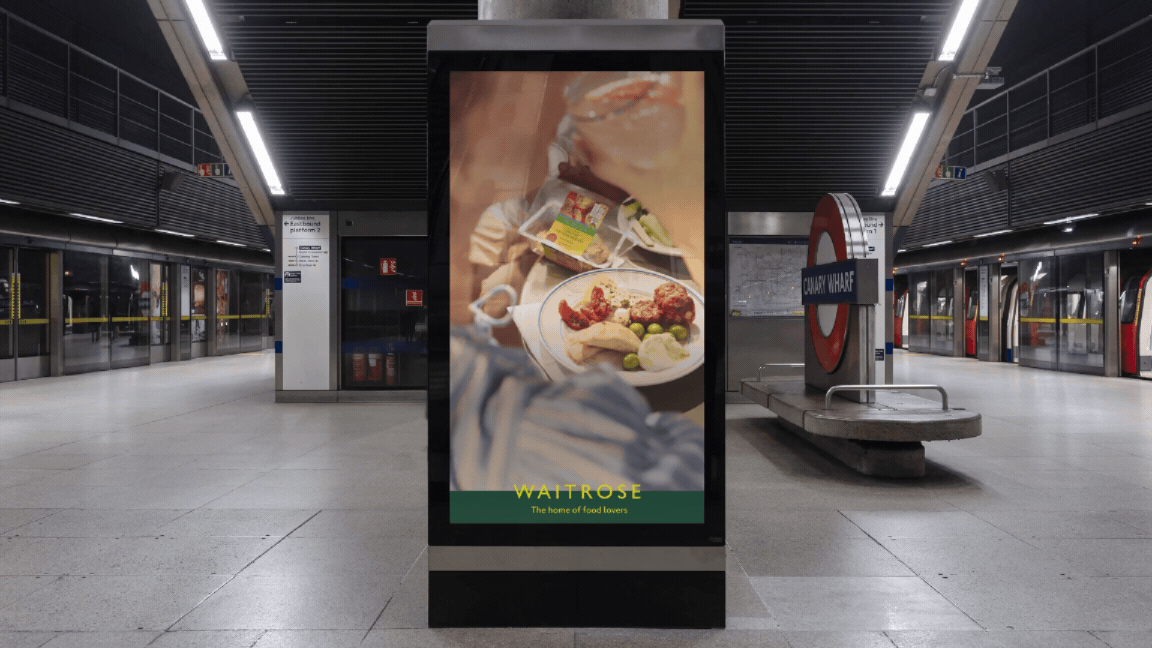
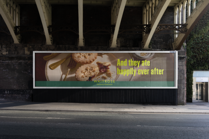
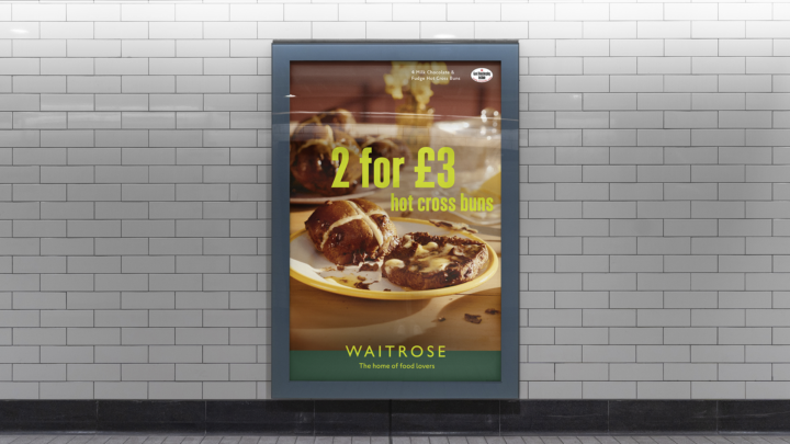
Waitrose | Brand Toolkit
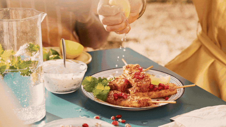
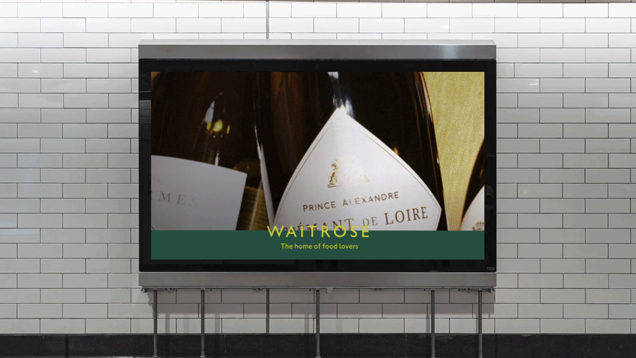
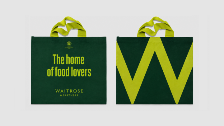
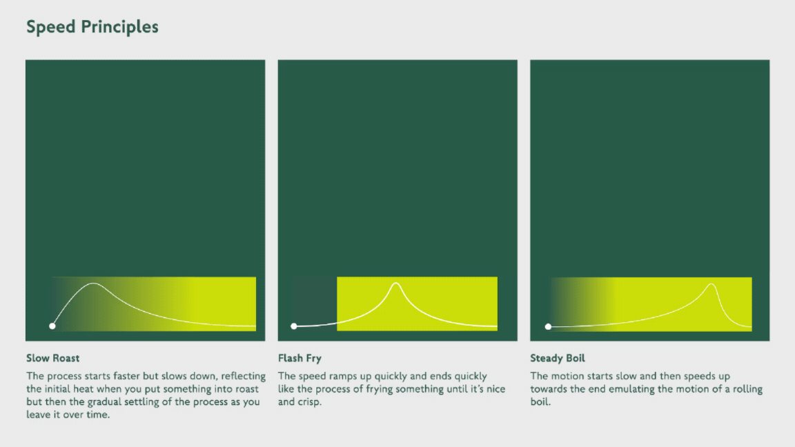
As part of the Waitrose brand refresh, we developed a flexible advertising toolkit that works seamlessly across out-of-home, print, and digital. Built around the brand's new typefaces, simplified colour palette, and authentic food photography, the system celebrates real moments inspired by food lovers. Alongside the visual identity, we created a set of motion principles rooted in the rituals of food - from the way dishes are served to the intimacy of sharing meals- creating a distinctive and consistent design language across every touchpoint.